Exploring the north

9 12 2008

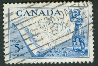
Canada, 1957, Scott 370, 34mm x 23mm

Canada’s great geographer, David Thompson, is honored on this issue. He appears in the foreground sighting through what appears to be an octant, with the background dominated by a curly-cornered map of the western section of the dominion. This is one of those striking  juxtapositions of features in contrasting scales which we have seen before.

The figure is not a detailed likeness of the man’s face, choosing to emphasize instead the details of his traditional garb. The map has its own emphasis not on the mountains or forests but rather on the watersheds of the major rivers and lakes of the western provinces, which ties into the search for a passage to the Pacific Northwest that was a major motivation for Thompson’s explorations. The way in which the various headwaters twine around but stay separate almost seems to express a note of frustration that this did not work out as hoped.


Explorador

12 03 2008

CabrilloCabrillo with added infoUnited States, Scott 2704, 1992, 22mm x 38mm
The design depicts the 16th century Spanish-Portuguese explorer Juan Rodríguez Cabrillo wearing a breastplate and a helmet in the Morion style backed by a galleon and the outline of the California coast near San Diego. I am showing it here both as a traditional plate block of 4 and as a strip of 3 with attached selvage, which reads:

On September 28, 1542, explorers representing Spain landed at San Diego Bay, California.

Juan Rodríguez Cabrillo led the expedition. He named the area San Miguel and claimed it for Spain.

If he was Portuguese as many believe, his name would be spelled João Rodrigues Cabrilho.

The plate block just has registration numbers along the edge. The map content is pretty minimal, lacking labels definitively identifying the location within California.

For me the main interest in this issue is not so much the map but the portrait. Cabrillo is tan, virile, visionary. He looks like Jonathan Frakes in costume and makeup. To me he looks nothing at all like his portrait, making me suspect that some parties in the office of the U.S. Postmaster General of sexing up this subject to entice the collecting public. This is perhaps not a bad thing in itself, just a bit of warning on using philately as a source of historical fact.

The other point of interest for me is the street name mentioned in the Wikipedia article. Convienently, this fellow’s last name falls nicely in the alphabetic sequence of the avenues out near where I grew up in San FranciscoAnza, Balboa, Cabrillo up in the Richmond district up against Golden Gate Park, down through the Sunset including Santiago where my parents still live, all the way down to Wawona and Yorba. Not all of these were featured on postage stamps, of course.


Aurora Australis

30 01 2008

Antarctic exploration ship Fuji and the map of the continent

Japan, Scott 857, 1965, 33mm x 28mm

This understated item depicts an map of the continent of Antarctica, the observation ship “Fuji”, and the ghostly Aurora Australis sketched in above it. The blue background represents both the Southern Ocean surrounding the landmass and the extreme southern night sky where the sun does not come up for days or weeks in winter. The map itself is simply an outline of Antarctica, only one coastal base indicated by a dark dot on the Indian Ocean side. On it, superimposed in the same yellow as the aurora, are circles of latitude and lines of longitude, including the dashed Antarctic Circle at 66˚ 33′ 38″ S latitude.

Among continents, Antarctica is larger than either Australia either Europe, with only a tiny fraction ice-free. There is no permanent human population, only a constantly changing crew of researchers and support personnel from many countries.

Unlike some of the other designs we have seen here, there is a balance between the two large elements horizontally, as well as a vertical balance between the ship in its dark silhouette and the light colors above it. The contrast between the feathery edges of the aurora and the sharp edges of the rest of the design is one that takes advantage of color lithography – it would be quite impossible to suggest this in gravure.


Mutton and muttonchops and a map

10 01 2008


Image Hosted by ImageShack.us
By milkfish, shot with HP Scanjet G3010 at 2008-02-02
Image Hosted by ImageShack.us
By milkfish, shot with HP Scanjet G3010 at 2008-02-02
Australia,
Scott 204, 205, 1946, 23mm x 23mm

The stamp commemorates Sir Thomas Mitchell’s exploration of central Queensland, Australia. The intrepid explorer looks resolute against a map of the state, flanked as he is by two sheep and a cow. He is well remembered by having a town there named after him.

Sir Thomas’s expeditions into the tropical northeastern part of the continent occurred ten years after he had mapped the region which is now the state of New South Wales. Project Gutenberg has a lovely map prepared from his survey. Here’s a related quote from his memoir:

I was busy endeavouring to complete my maps before other cares should divert my attention from the one subject that had occupied it so long. But in perusing nature’s own book, I could, at leisure, think sometimes on many other subjects, and I fancied myself wiser than when I set out,—much improved in health,—bronzed and bearded; sunproof, fly-proof, and water-proof: that is to say, proof against the want of it, “LUCUS A NON LUCENDO.”

(That last little bit meaning “It is a grove for not being light.“)


An eight-day voyage one summer

23 12 2007

USSR 4586

Let’s start out with a Soviet miniature sheet from 1977 depicting the voyage of an arctic vessel, presumably on a mission of exploration. The designer chose a red line to show the ship’s path which picks up nicely the vivid red of the oversized flag stuck into the North Pole proper.

Of course, right out of the gate now, I’m cheating a tiny bit, because there’s only a little smidgen of map on the stamp itself which focuses on the “Arktika”; all of the map-related action is taking place in the margins around the perforated portion.